How an R-map visualization has helped to improve the state of the SA health facilities data in the covid19za repository
In this post Nompumelelo Mtsweni, an independent web developer, working with the Data Science for Social Impact (DSFSI) group at the University of Pretoria, and the afrimapr team will describe how they collaborated to create and use an application to view collated data on South African health facilities to help with data cleaning. .
DSFSI have been working with volunteers on an open COVID-19 dataset and dashboard to assist with the South African response to COVID-19.
Collecting and cleaning open health facility data for South Africa has taken a lot of work by dedicated volunteers. The data that are openly available have various issues that need resolving to make them useful.
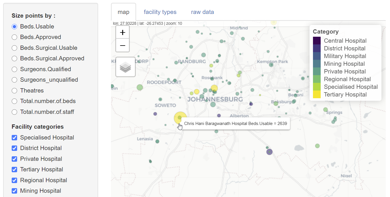
The afrimapr team were able in a few hours to use code components from their existing healthsites viewer to make an application to view the interim data collated for South Africa. This application is not intended to be a polished tool targeted at public users, instead it is a rapid solution enabling project participants to view the data as they clean it. By re-using existing components, and relying heavily on the R packages shiny and mapview, it consists of less than a hundred lines of code. The application accesses data directly from the raw data file hosted on the DSI github repository, thus any new data updates will automatically be incorporated without needing to modify the code. With this benefit comes the associated risk that if the data are moved or changed sufficiently the application will break.
In the application users can view :
- an interactive map with symbols representing hospitals coloured by facility type and sized by selectable hospital attributes such as the numbers of beds or staff.
- a bar plot showing the frequency of different facility types.
- a table displaying the raw data.
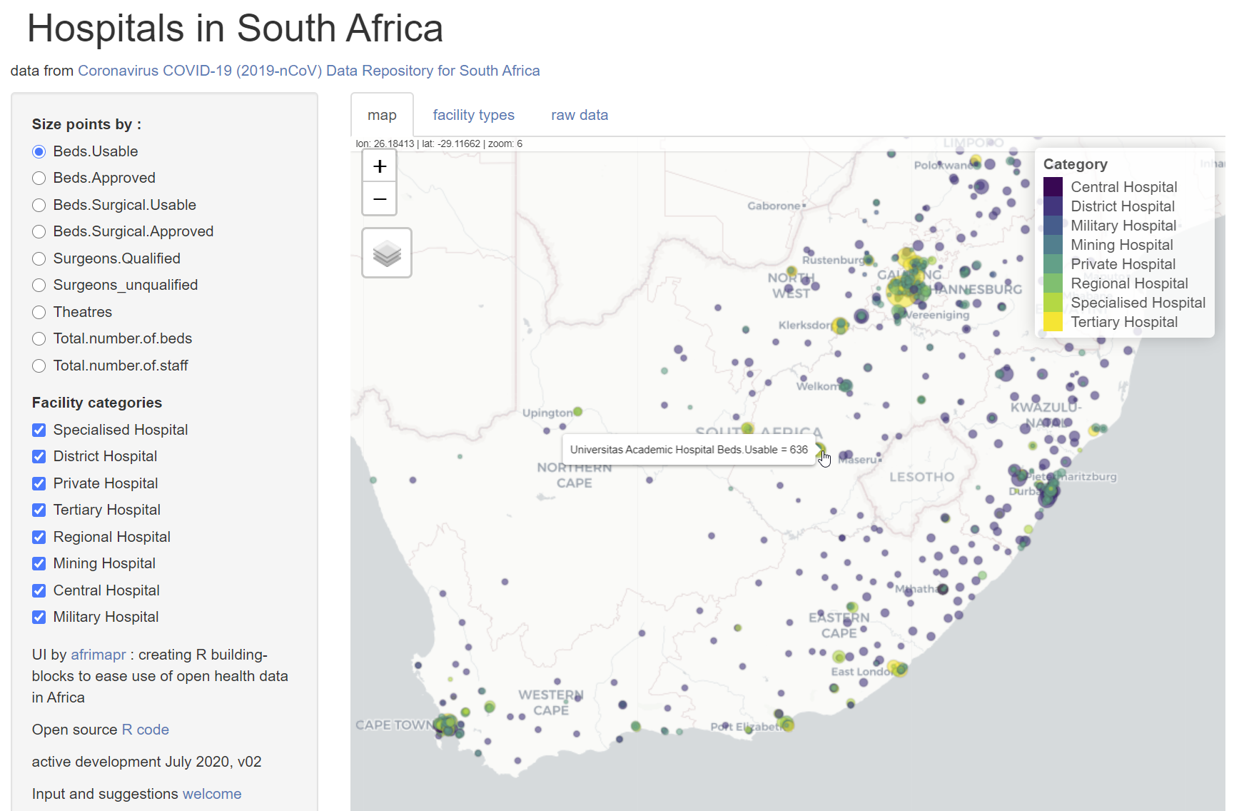
Among the anomalies identified when visualizing the data, there was an inconsistency in the number of spaces in facility type names and duplications related to hospitals classified into two different facility types. The latter was detected simply by spotting that one location symbol was a different colour to the rest due to an overlap of two points at the same location. These anomalies could be corrected and the results tested straightaway by re-loading the application.
From the perspective of DSFSI the quality of the open data have been improved, and there is an application that allows further updates to be viewed. There appear to be still considerable gaps in the data that are available publicly, and this is probably the greatest constraint on developing useful tools. From the perspective of afrimapr this is a small example showing how R code components can be put together to develop local solutions. We look forward to developing more.
Nompumelelo’s work is funded by the Office of Astronomy for Development’s Extraordinary call for COVID-19 related proposals.