Here we demonstrate how R can be used to make sub-national COVID-19 data for selected African countries more usable. In the afrimapr project we’ve created an africovid R package and demonstration africovid viewer that currently contains 65,000 rows of data. Each row represents COVID-19 cases, deaths and recoveries in one subnational region for one day, disaggregated by sex where available. This is work-in-progress, we are sharing it here in case it is useful to others and they would like to contribute to improvement.
Well known international efforts have collated COVID-19 data at a national level. However COVID-19 data for African countries at a finer, sub-national, geographic resolution are not widely seen. Some data are published by government ministries of health on websites or social media feeds in a range of different formats but are generally not easy to process. This inspired Humanitarian Emergency Response Africa (HERA), a French NGO, to start a COVID-19 Data Project in March 2020. HERA has been manually collating available data from government sources thanks to a great team of volunteers. They have been making these data available on the Humanitarian Data Exchange (HDX) the humanitarian data platform of UNOCHA (United Nations Office for Coordination of Humanitarian Affairs). Analyzing disaggregated data about COVID-19 can lead to a more proactive response to the pandemic at the local level for national authorities, public health stakeholders and international and local organizations. HERA strongly believes that local actors need to be provided with reliable information to respond more efficiently and appropriately to the crisis.
In afrimapr we agree. We saw these data and saw an opportunity to make them more useable, particularly for R users. The datasets are available for download as CSV files by country and are updated regularly. We realised that we could read these data into R and make them available in a package so that others wouldn’t have to go through the steps of importing and cleaning the data and joining to other useful data sources. This fits with the afrimapr strategy of making ‘building-blocks’ that others can use to build their own solutions. This can free up others to be able to spend more time on actually putting the data to work.
The subnational data are available for manual download from the Humanitarian Data Exchange page for HERA or HERA’s website. Automated access, i.e direct from a code script, can be much more efficient given that there are a number of countries and the data are updated regularly. Fortunately the rhdx R package developed by our collaborator Ahmadou Dicko provides the ability to directly download HDX data from R.
We created the africovid R package that provides
- access to collated and cleaned versions of subnational Covid-19 data,
- functions to start visualising the data, including a shiny app
- a function to help us update the data
A little of the technicalities of how the package works. africovid has an update_data() function that uses rhdx to search HDX online for datasets containing the terms “hera subnational”. Then we go through a manual process to check which of these datasets to include. The simple search also returns datasets for Ebola and national levels which HERA has also collected and that we don’t need at this stage. The update_data() function loops through all the desired datasets, reads them in and collates them into a single dataframe after correcting a few inconsistencies and formatting date and numeric values. HERA also make available city level data that could be incorporated later.
To be able to view the data for each country we chose a heatmap, not a spatial map in the conventional sense, that allows a clear view of all days and regions at once.
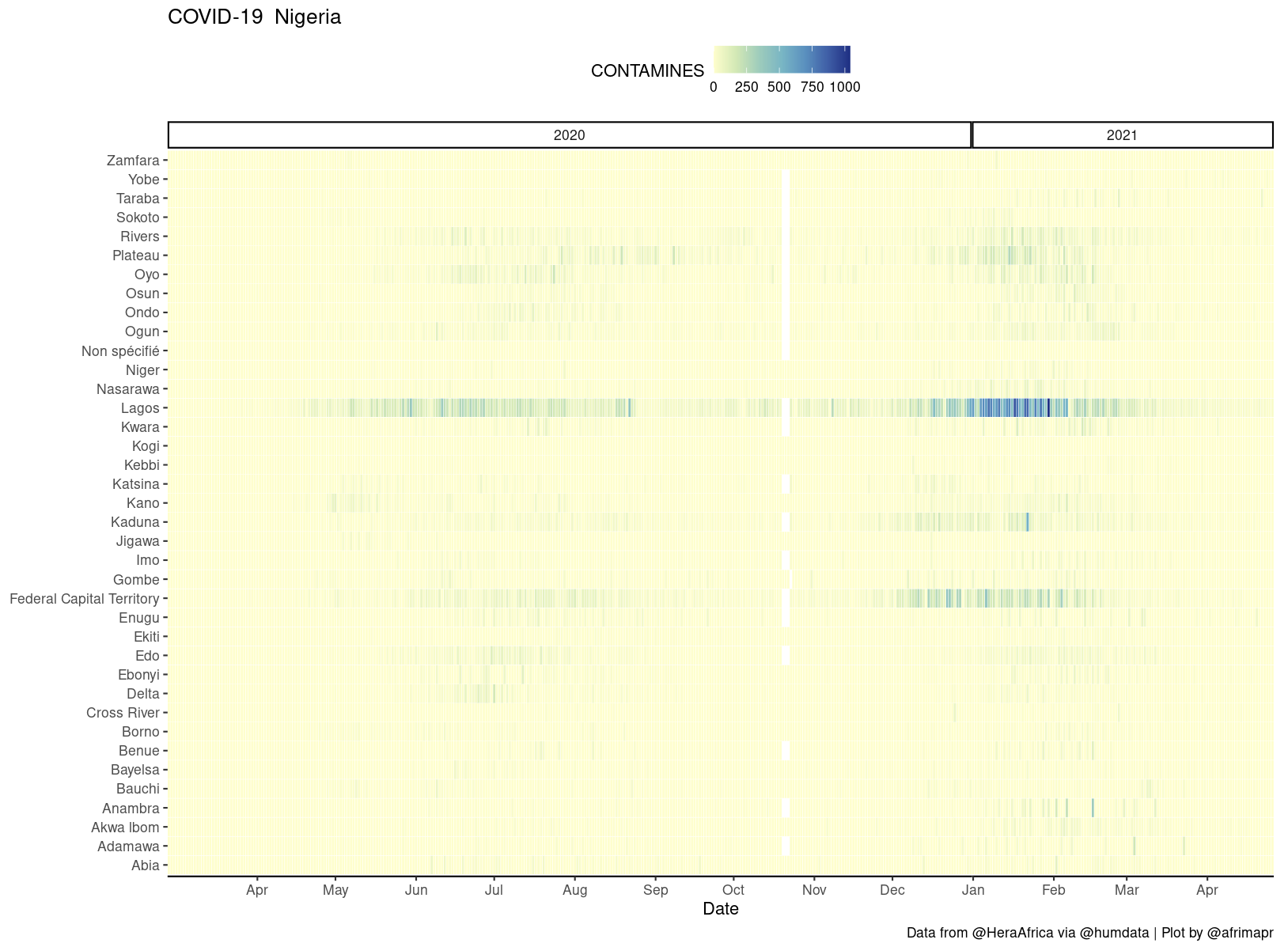
Our heatmaps were inspired by Colin Angus’s excellent work visualising UK COVID-19 data (when I say inspired I mean I started by copypasting parts of his ggplot code, thanks Colin !). These plots also have the advantage that they don’t require joining to any other datasets, so they work with any region naming.
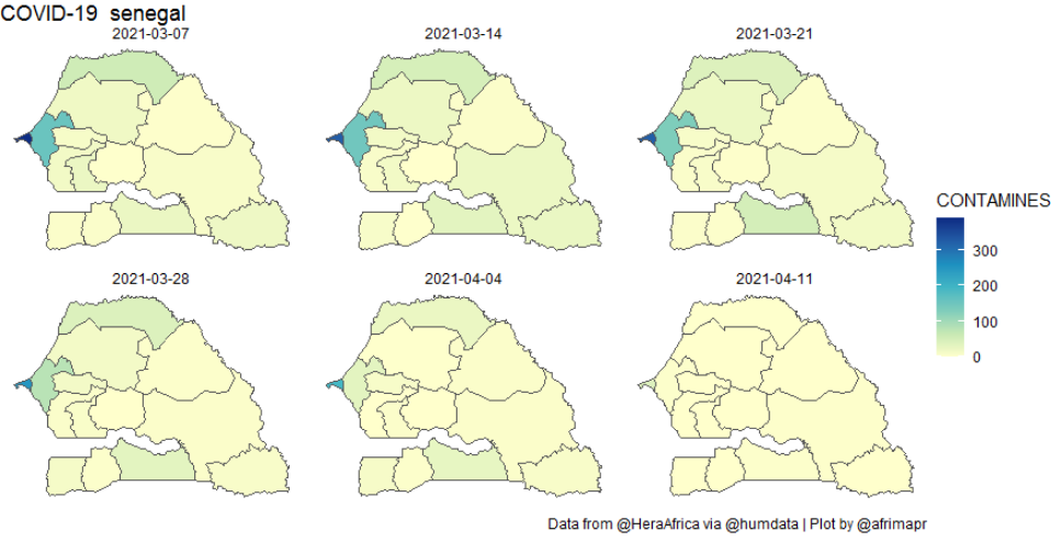
We also wanted to be able to view spatial patterns on a more conventional map. For that we developed a function (afcov_map()) to make choropleth maps. That involves the extra difficulty of making sure that the region names from the COVID-19 data match up with a source of spatial boundaries. For the spatial admin boundaries we build on our own afriadmin package that in turn relies on rgeoboundaries for automated access to boundaries from the excellent geoboundaries.org. The process of joining data to admin boundaries is something that we deal with in the afrimapr interactive online tutorials.
Both the heatmap and map functions accept optional arguments for dates and time intervals to sum over, so that users have flexibility to explore the data. For example the following code can be used to create the weekly plot below.
afcov_map(‘senegal’, dates=c(“2021-03-01”,”2021-04-10”), timeinterval=”week”)
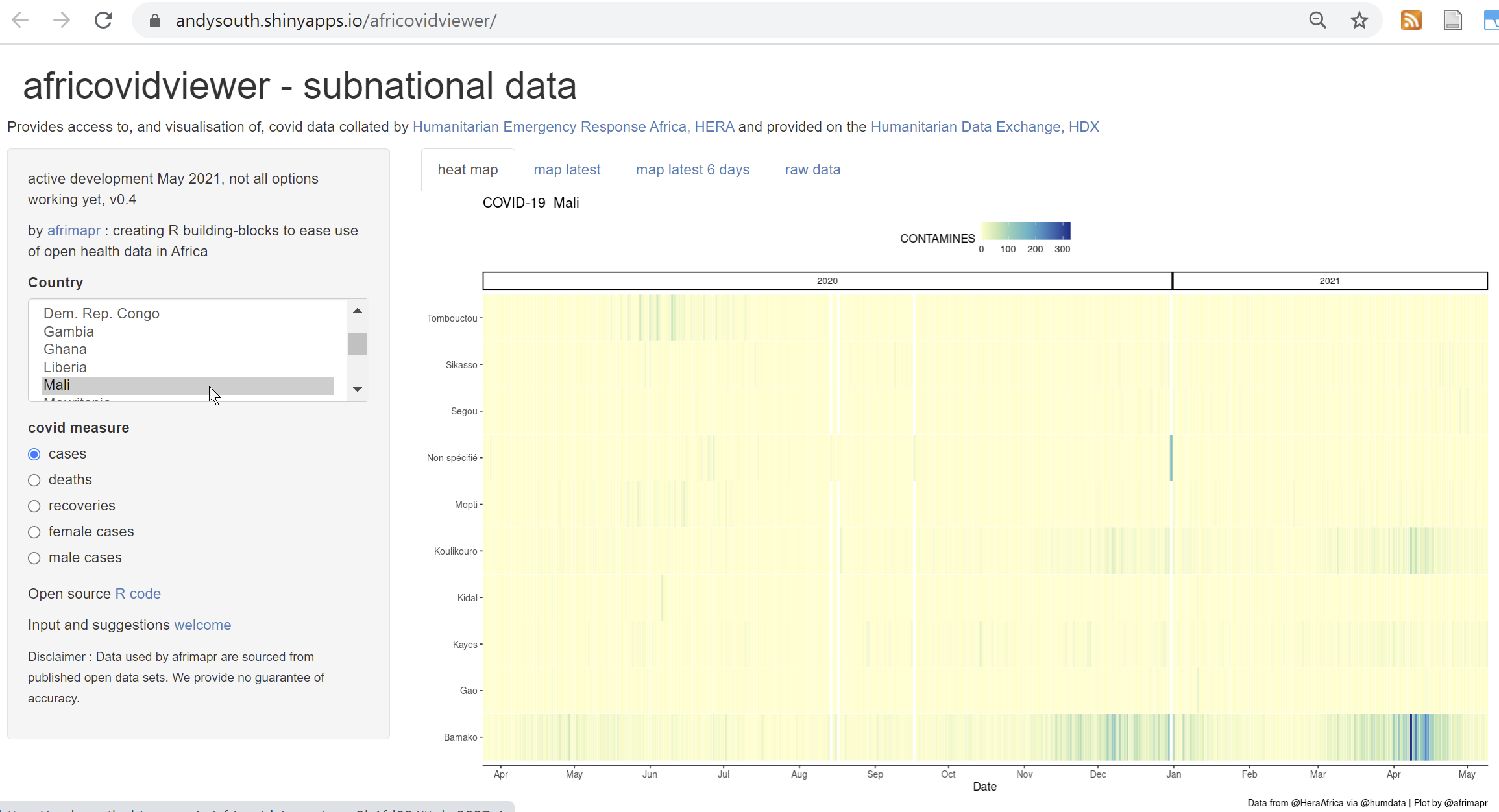
We also include africovidviewer (a shiny interactive web application) within the africovid package, allowing users to select a country and see what data are available.
We recognise that there are plenty of things that can be done to improve these tools and data. The excellent covidregionaldata R package collates similar data for other regions, but does not yet have these African countries so there is potential to add them there.
If you notice anything particular that would make them more useful to you then please get in touch with us at afrimapr or HERA. Together we can make these data more usable to help inform local COVID-19 responses.
The work described in the blog post was a collaboration between Andy South (project lead - afrimapr) and Laura Jonnard, Cofounder of Humanitarian Emergency Response Africa (HERA)