The past month showed a flurry of activities around three things dear to our hearts - African data, maps, and R! See below for images & links to the beautiful maps that people made.
Thanks to the kind people from the R for Data Science Online Learning Community (R4DS), our {afrilearndata} package was featured in the #TidyTuesday challenge of 9 November 2021.
The main goal behind #TidyTuesday is to help “data scientists practice their data wrangling and visualisation skills by providing weekly released, real-world datasets, and to encourage sharing of code to facilitate social learning” [1]. #TidyTuesday was started in April 2018 by Thomas Mock fromR4DS. The initiative is hosted on Twitter and anyone can access the weekly shared data set and submit their results along with the code under the hashtag #TidyTuesday.
Coincidentally the #30DayMapChallenge also runs on Twitter in November. This mapping/cartography/data visualization challenge was started by Topi Tjukanov in 2019 . For the past three years, Topi has been posting 30 themes - one for each day of November - which informs the global community what kind of map to focus on for the specific day. This challenge isn’t limited to maps developed in R, but participants are allowed to use any GIS tool to create their visualisations. Luckily, there’s a large overlap between the R community and geospatial community on Twitter, and the #30DayMapChallenge brought even more participants to the African mapping challenge set by #TidyTuesday.
It was great to see that participants in the two challenges did not only use data from the {afrilearndata} package, but also a variety of other African datasets covering topics such as Polio vaccinations (OurWorldInData), wealth (World Bank), urban growth (OECD), urbanization (Natural Earth), electricity access (World Bank) and more.
We’d like to thank the community for their enthusiasm and the beautiful maps and code that was shared! We’ll definitely use this as inspiration for future afrimapr activities, community meetups and training. We learnt things ! For example, it can be tricky plotting population data because it is often not evenly distributed. There are often rare areas with very high densities and frequent areas with low densities, this can be difficult to display and led to exchanges about how best to present. We also learnt about ways to plot raster data in ggplot2 using as.data.frame.
Please join us in the R4DS Slack workspace where we have a dedicated channel to chat about maps, African data, and R - #chat-africa_maps. We also host monthly community calls where we do code walkthroughs and more! Follow us on Twitter or join the Google Group to be kept in the loop!
Here are links to the maps and code that people shared on twitter. If we’ve missed yours out, do let us know.
| Tweet | Code link | Tweet link | Map image (click to enlarge) |
|---|---|---|---|
| Using #TidyTuesday data from the {afrilearndata} package to show population density and the largest cities in Africa. Did you know that only two out of the Top 10 largest cities are actually capitals? | code | @richard_vogg |  |
| For this week #TidyTuesday, about Africa Maps with R, I made a facets plot to show how Polio vaccine has nearly wiped out the disease from Africa in the past 35 years. Inspired by @afrimapr initiatives with data from OurWorldInData. | N/A | @issa_madjid | 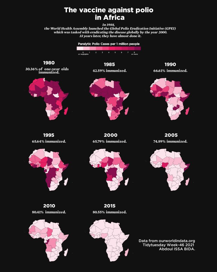 |
| Cross post for this week’s #TidyTuesday and day 10 of #30daymapchallenge, raster. Population density in Africa with raster data from @afrimapr | code | @geokaramanis | 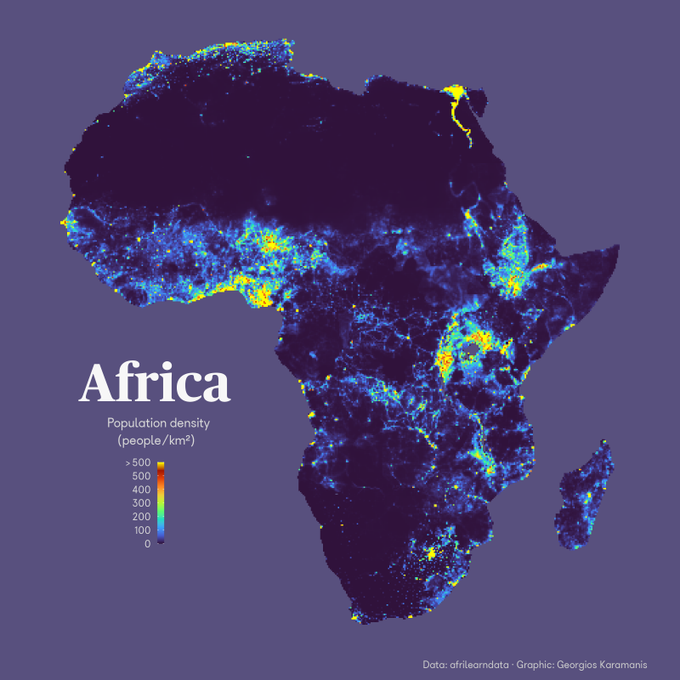 |
| African Health Sites The afrimapr package is a great resource for mapping healthcare sites across Africa. Used sf::st_simplify to stylise the countries. Doubled up with #30DayMapChallenge too. | code | @quite_grey | 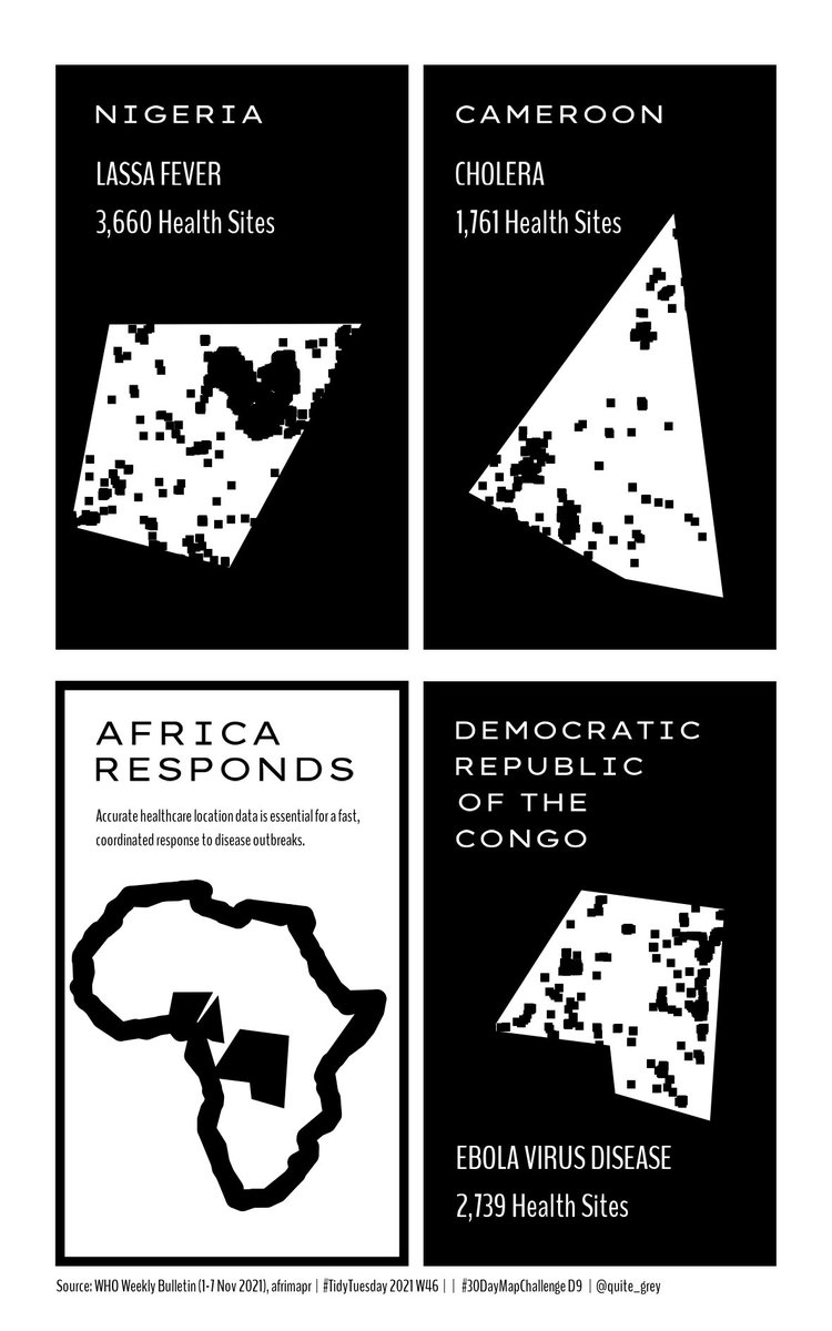 |
| I chose to make use of afrimapr’s spatial data to create a quick and rough overview of the number of official and recognized national languages across countries in Africa. | code | @dmncschmtz | 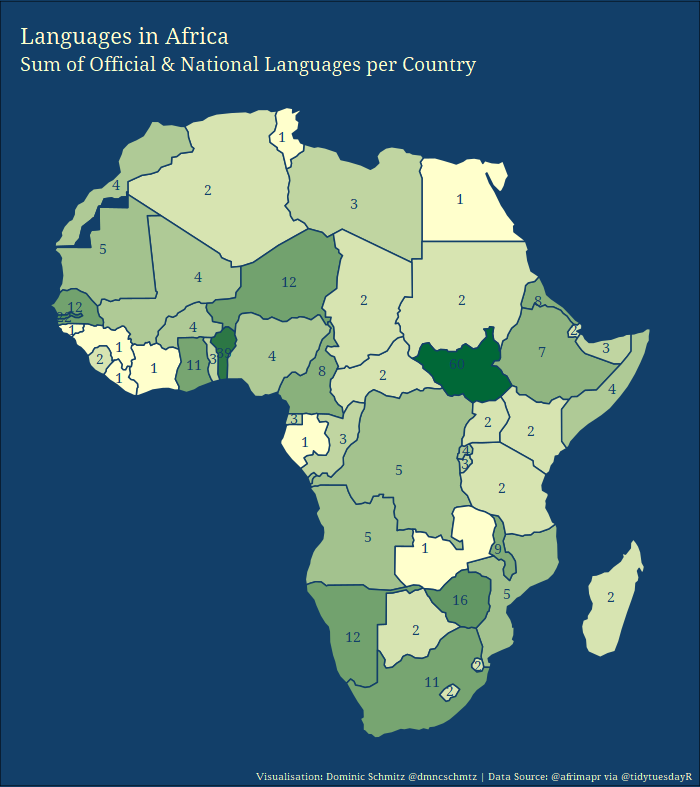 |
| #TidyTuesday week 46 #AfricaR data from package: afrilearndata (@afrimapr) | N/A | @johnmutiso_ | 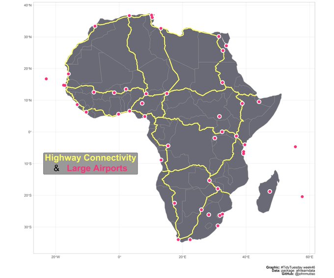 |
| Africa : Wealth versus Health ! | code | @G_abgrall | 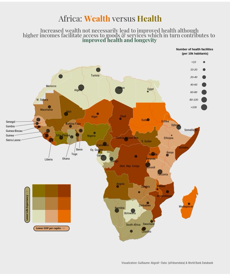 |
| For this week’s #TidyTuesday I used the airport dataset in the afrilearndata R-package. | code | @EmmaSkarstein |  |
| This week I worked with raster maps to explore population increase in Africa. | code | @TamayoLeiva_J | 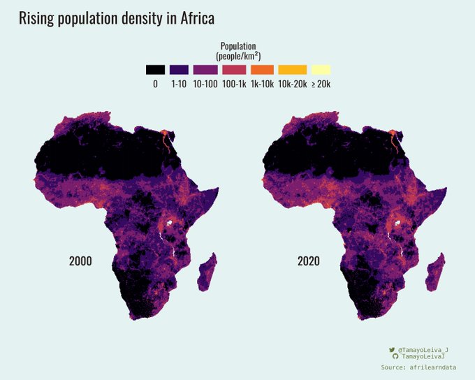 |
| Quick and simple #TidyTuesday (hoping to come back to this data set later this week when I have more time). I love a good census dataset so had to ask - When did each African country last have a census? | code | @nicci_potts | 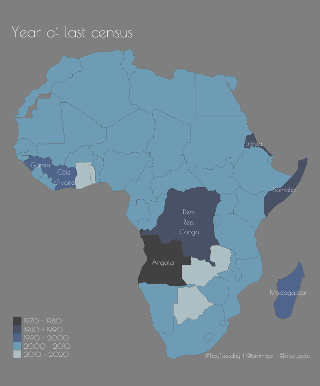 |
| This week’s #TidyTuesday using the {afrilearndata} package from the afrimapr team. I think I’m getting the hang of {tmap}. | code | @datasciencejenn | 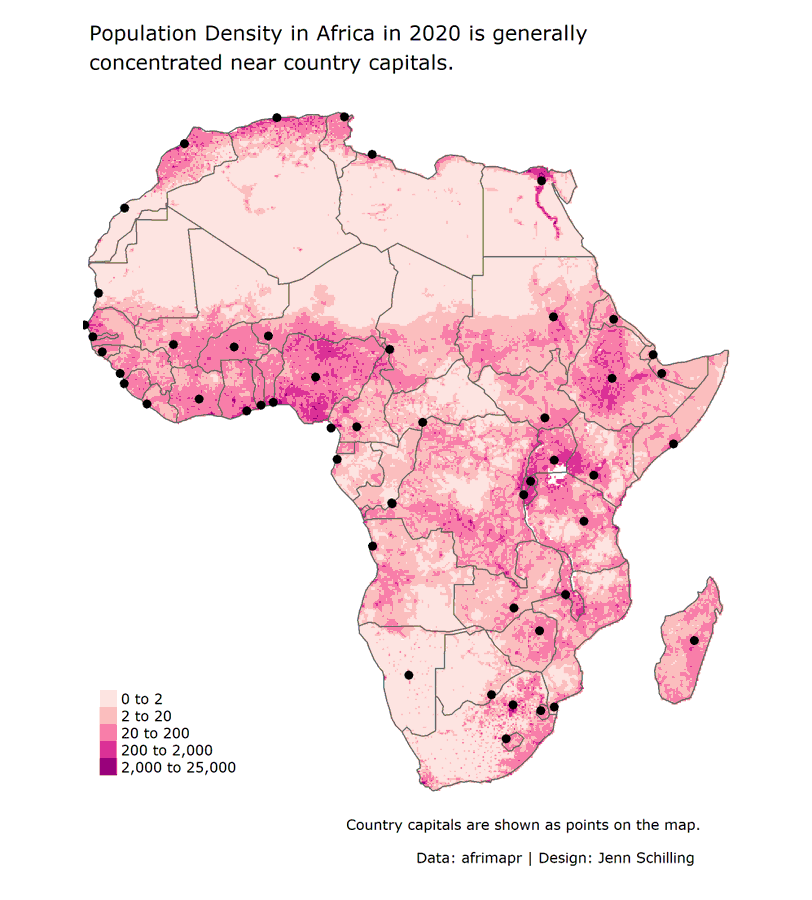 |
| #TidyTuesday week 46 afrimapr, data from afrimapr team and afrilearndata package. This week i try using {rayshader} and using log2 scale fill, but i am not sure if it is appropriate. Any suggestions are welcome. | code | @leeolney | 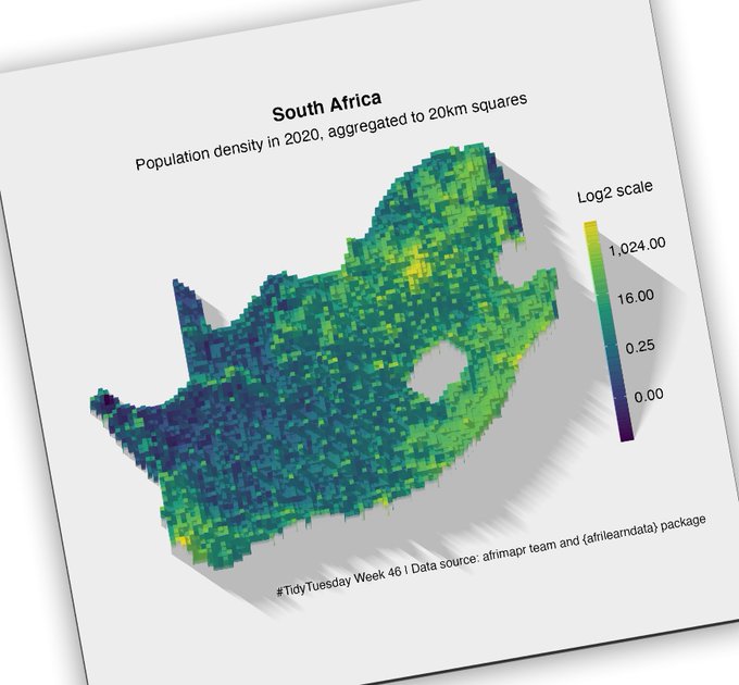 |
| A simple map of African capitals and their population size. Based on the {afrilearndata} package. | code | @toeb18 | 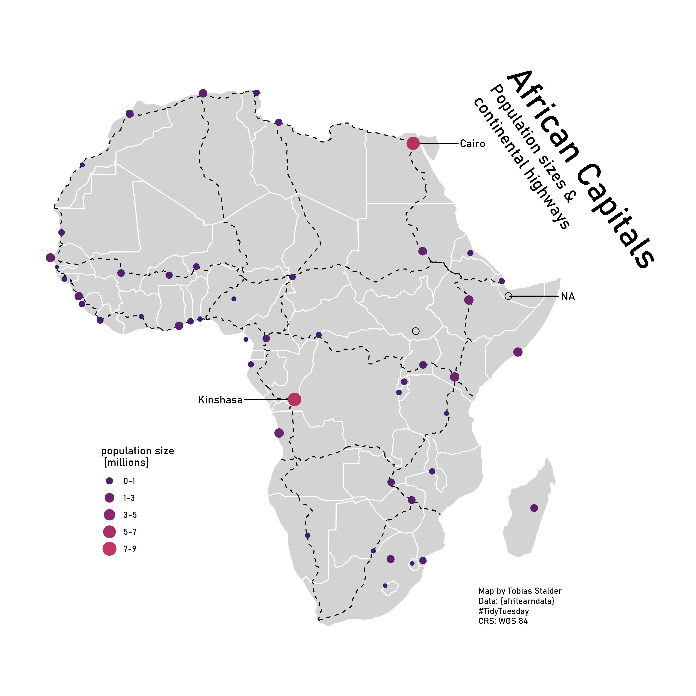 |
| Trans-African Highway network | code | @maxwelco | 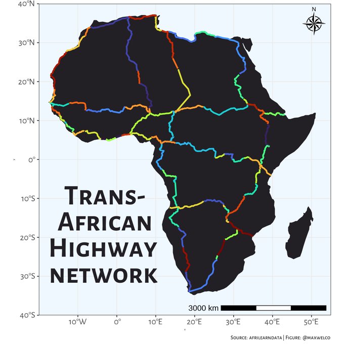 |
| Here’s a map displaying the distance to the nearest hospital within Sudan. | code | @Jamie_Bio | 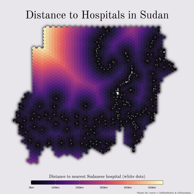 |
| A contribution from afrimapr : afripop_df <- afripop2020 %>% as.data.frame(xy=TRUE) %>% rename(pop=3) %>% filter(!is.na(pop)) ggplot(afripop_df)+ geom_tile(aes(x,y,fill=pop))+ scale_fill_viridis_c(trans=’pseudo_log’)+ coord_fixed() |
@afrimapr | 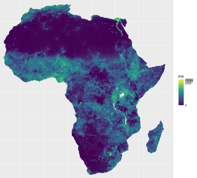 |
References
[1] Nischal Shrestha, Titus Barik, and Chris Parnin. 2021. Remote, but Connected: How #TidyTuesday Provides an Online Community of Practice for Data Scientists. Proc. ACM Hum.-Comput. Interact. 5, CSCW1, Article 52 (April 2021), 31 pages. https://doi.org/10.1145/3449126